Tuesday 5 April 2011

In what ways does your media product use, develop or challenge forms and conventions of real media products?


Above is nine distinct frames from my teaser trailer. I will be looking at how conventional/unconventional my teaser trailer is in this post.

Screenshot 1:
This shows my title and font used throughout my teaser trailer. The idea is that it is supposed to look like an envelope and the text follows on from the Poster and the Teaser trailer as I have used ransom note throughout all of my tasks to try and create suspense as if you don't know who is sending the letters. Each line of words appears one after the other and this works quite effectively is gaining the audiences attention when watching my teaser trailer.

Screenshot 2:
The second screenshot is of the location of my teaser trailer. The main part of this is in a river/on a river bank. This is similar to some other films that only stay in a few locations for the majority of the film. The reason I chose to have my character sitting there was to enable him to look like he was fishing and then suddenly look really shocked when he sees the body and the bag floating down the river.
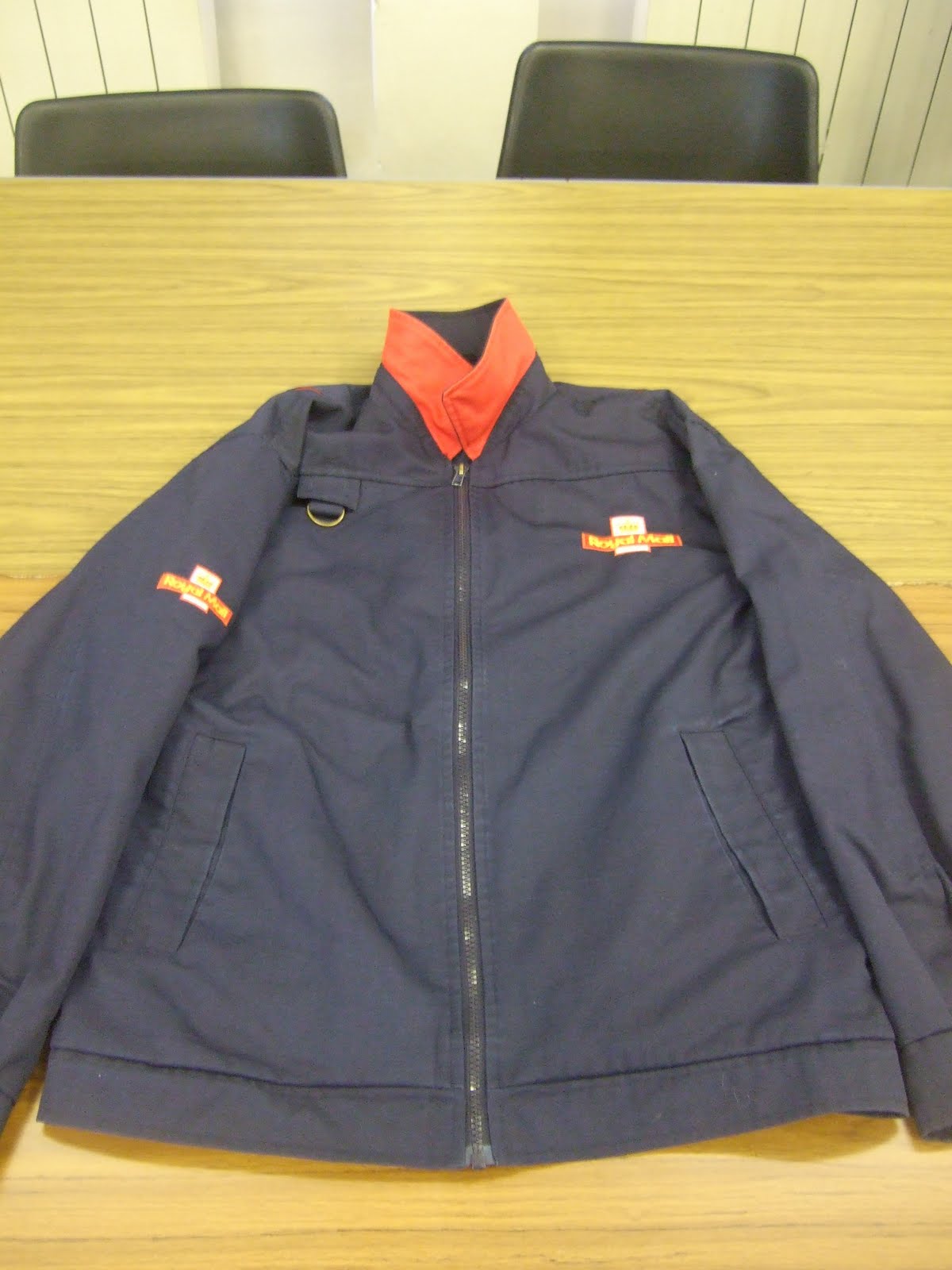
Screenshot 3:
As you can see from screenshot 3 I have chosen to dress my character in some typical 'old man' fishing gear. I started off by getting him to wear some old trousers/top and then added a large fishing like jacket and hat to add even more effect to make it look more realistic. For props around my character I used an old tool box for a bait/tackle box, a flask as most fishermen stay overnight outside, a rod rest and two fishing rods. I think without any of these individual props it would look less realistic. This follows conventions of other teaser trailers as most others also do their research into what the characters need to wear in order to look more realistic in the film.

Screenshot 4:
This shows part of th story. Before yo see this a board advertising a newspaper headline you don't really know what is going on as yo just see the fisherman looking shocked and then you see the body. Once you see this you realise that the postman has gone missing and this isn't a one off occurrence. I think this shot really sets up the narrative in the teaser trailer as it gives the viewers more of an idea about what is going on.

Screenshot 5:
This screenshot shows the style used for all of my titles/inter-titles. I have followed on from the title again by using the same font on the same background in order to keep it looking consistent throughout all of the teaser trailer. Again this follows what other teaser trailers do by using the same text etc.

Screenshot 6:
This screenshot is to show just one of the variety of shots/positions used when filming/editing my film together. I think I have followed the typical conventions of a teaser trailer as i have used a variety of shots, transitions and effects throughout my teaser trailer. I think I have shown an improvement since last year when doing AS as I didn't do any filming then I just did editing. So I have had to learn a few things such as holding the camera steady, how to film from certain angles and how to use the tripod effectively.

Screenshot 7:
I have used this screenshot to try and show you what genre my film is. I could have used another shot of the body in the water but I have already used this twice so I opted to go for this shot. he reason I chose this is because in most horror films like mine you have someone who is genuinely shocked or scared. In my teaser trailer I have used this typical horror film convention by getting my actor to appear shocked and scared when he first gets a glance the body in the water.

Screenshot 8:
This postbox screenshot is used to show how one of the characters is introduced. Although you don't see this character appear in the rest of my teaser trailer you see their hand go up to a letterbox, deposit a letter and that is it. I did this because in other films like mine you have an element of the unknown. i.e. you don't know who it is and what they are doing. I used this in my teaser trailer to create suspense and get the audience guessing as to what is going to happen in the rest of the teaser trailer.

Screenshot 9:
This final screenshot I have used to show one of the props again. I used this to make my news headline look more 'real' and i thought the red at the top of this would also gain the viewers attention and draw them into this. The reason I used this prop is to bring the narrative together to try and give the viewers more of an idea about what is going on in my teaser trailer. Other horror films similar to mine also use titles/news to do the same thing.


How effective is the combination of your main product and ancillary texts?


As you can see from the images above I have used the same style throughout my main task and my ancillary task.

As you can see the main link between all three tasks is the font used. I have used a font called Ransom Note. After a tedious task of trying to find one I found this. I chose to use ransom note because I thought it would go with the idea of the story (an unknown person posting letters and a postman going missing and we don't know why). It is quite mysterious as it looks like letters have been cut out and stuck down randomly.

There is a link between each of my ancillary tasks. The link between my poster and my magazine is that firstly I have used the same image. An image of a postbox in a quaint village in Hampshire with a black background and the postbox is red. I used this as i thought it would attract an audience when they see it either on the shelf in a shop or they see the poster on a billboard somewhere. The next link between the two is the same font (Ransom Note) again used to create mystery.

For my poster I decided to use red and white text as this is bright and bold. I also chose to use these colours as the white and red connotate blood and skin colours and there could be blood seen further on in my film. Although you cannot see some of the text straight away I decided to do this because it means the viewer of the poster has to look further into it to read what it says. This is the tagline for my film "Do you dare read your mail?". I decided to include "Spring 11" and "www.ssdmovie.com" as this is the website and the release date for my film. This gives the viewers a chance to research a bit more about the film on the website and try and create some viral marketing.

For my film titles in my teaser trailer I again used the Ransom Note font using a variety of colours on the envelope background. I also used the same for my magazine front cover. I used this so that when someone sees the text on the poster and then they see it on the magazine after they can automatically link it to that film they saw the poster of. This means hopefully they will be attracted to the magazine/poster. I have chosen to use a variety of colours rather than red/black/white as it will attract its audience to it.

What have you learned from your audience feedback?


Here is some audience feedback from my class when we watched each others teaser trailers and looked at the ancillary tasks:

Positives:

Teaser Trailer:
Music matches very well
All the images complement each other which makes it quite eerie
The sun newspaper headline - the little touch adds to mise en scene
Like the fact using real Royal Mail Jacket
You can clearly see you've put a lot of effort in
Shot types - hand held and steadiness of shots is good
Props - body is great and realistic
Ransom lettering looks good and goes with the film
Mixed up shots - not in order is eerie too
Newspaper - "another worker goes missing" makes you want to watch more of the film
Poster:
Red post box with the black background is good.
Good use of font throughout
Good picture with the river in the background

Magazine:
Good use of images
Great Layout
Looks just like a magazine front cover should do

Negatives:

Teaser Trailer:
Titles too bright - doesn't fit with mood
Opening logo - too long

Here are some comments from YouTube about my video:

"Really good video! I think that the length of the clips are good, as even though some other horror teasers may have shorter clips, the length of your clips reveals the plot, which is essential to your teaser. I especially like the part with the headlines, with the use of the word "another" revealing that this will be a main theme in the film if it were made. The negatives of the teaser are the transitions (fading to white) and sometimes the zoom on the postman is a bit wonky. But other wise good!"

"I think you have combined the props and location very well, it creates an eerie effect seeing a body floating down a river. You have shown the horror genre well by the tense mysterious music, costume and props. I like the part when the man fishing looks shocked with terror when he notices the body, this also makes the audience question what has happened. You have given away very little information in the teaser which makes the audience want to know more. The titles also show the postman theme and you have used the font like in a ransom note which is also very mysterious as it shows someone was after this character. Well done Dan :)"

"I like how you have used many different camera shots, for example your pans and zoom outs. Also your mise-en-scen is very good as you have used real Royal Mail clothing and 'The Sun' bulletin board.

However, I think that you could of filmed in a wider range of an area and introduced the character before seeing the body in the river.

Other then that, It all fits really well, the footage, the font choice and the music :) WELL DONE"


How did you use new media technologies in the contruction and research, planning and evaluation stages?


In order to create my teaser trailer I have needed to use all of the above equipment/programs.
I used YouTube to research similar teaser trailers and then blogger to add the videos and then analyse them. I also used an online resource called Pearl and Dean to to research the ages/gender and type of people that view similar films to mine in order to target mine to the right audience. I have used blogger to post my ideas, thoughts and developments that relate to my teaser trailer and ancillary tasks.

When I was making my teaser trailer I used a Canon camera and a tripod. With the footage I captured I then used Adobe Premiere Elements 7 to edit, cut and paste this all together. For the ancillary tasks (Magazine front cover / Film poster) I used programs such as Adobe Photoshop, Adobe Illustrator and Microsoft Paint to manipulate and change images and set them out to make them look like 'the real thing'. Over the 2 year course I feel I have improved when using the technology and software as last year I mainly did the majority of the editing rather than filming so I think I have improved on the filming/directing since last year.

Saturday 26 March 2011

Finished Filming / Started Editing

Today I finsished filming for my teaser trailer. I am going to upload the raw footage to Adobe Premiere Elements and the begin editing. I am pleased so far with the footage i took and look forward to editing this together to create my teaser trailer.

Friday 18 March 2011

Certificate Rating

I looked into 'British Board of Film Classification' and found out the following is relating to a 15 rated trailer:

Only those over 15 years are admitted.
Nobody younger than 15 can rent or buy a 15-rated VHS, DVD, Blu-ray Disc, UMD or game, or watch a film in the cinema with this rating. This rating is similar to the. Films under this category can contain adult themes, hard drugs, strong words, moderate-strong violence/sex references, and mild non-detailed sex activity.


My trailer will be 15 because of the content it includes and I dont want to upset any younger audiences.

Monday 14 February 2011

Costume Research

I am going to have to find costumes for two people in my teaser trailer. The first one being the angler and the second one being the post man (not a real actor just a floating body in the river).
For the angler I want them to be dressed casually as you would if you where going to be going fishing. Perhaps in the actors normal casual clothes. I am still yet to decide who is going to play the part of the angler. Ideally I would like it to be an older person who is likely to be fishing in a secluded part of a wooded riverside.
Here is an example of an angler.
Although the picture is not very clear the gentleman clearly is wearing dark clothing and a hat. I would ideally like to try and replicate this when I film my teaser trailer.
Secondly in order for my trailer to be effective the postman's body needs to look quite realistic. To make it look better I will be dressing the body like a postman.
I have got some navy blue mens work wear trousers that the postman can wear as this is what they wear. Also through one of my friends I have the ability to borrow a real postman's work jacket with the Royal Mail logo and a reflective flourescent jacket. As you can see from the pictures below this should look very realistic.

Wednesday 9 February 2011

Shooting Schedule

I am currently in the process of creating a shooting schedule for my teaser trailer. I have decided to start filming in half term (18th Feb - 25th Feb). This therefore allows me more time to prepare my props and finalise my plans etc.

Shooting Schedule:

Day1: Film river scenes including the floating body.
Film the newspaper board.

Day2: Film the postbox and hand scene.

I am going to go through all my footage at the end before I finish each day to double check i have got everything before I leave the shooting location and get back to school.

Tuesday 8 February 2011

Props Needed

Before I begin filming for my teaser trailer I will need to obtain all my props. In order to me my postman look even more realistic he needs a postman's bag which is going to be floating down the river before him. As i was unable to get one of these I have decided to just use a plain red messenger bag which looks pretty similar in my opinion. This is a picture of the messenger bag I am going to be using.
The other props I am going to need are fishing equipment for the angler. As some of my family used to do a bit of fishing I already have this at home so I can just use this. Here are the pictures of this.

[PICTURES TO BE UPLOADED WHEN I GET THEM]

Monday 7 February 2011

Music / Sound Research

Today I was thinking about what music I could play over my teaser trailer. I have been looking on the website that I found music from last year (www.freeplaymusic.com) but yet to find anything even vaguely suitable due to the fact we can only use non-copyright music. This is hard to find for the type of film I am making. I will keep looking over the next couple of weeks to try and find something suitable and if I find anything suitable I will post it on my blog.

Location Shots

Here are some shots of my filming location to show what I will film and where.

(I will upload these when I get the pictures)

Here is a birds eye view of filming location to show the proximity between the three different aspects of my teaser trailer.

Monday 31 January 2011

Dialogue / Script

In my teaser trailer for "Signed, Sealed and Delivered" I do not plan to have any form of communication as I am only going to have one character. Therefore there is no dialogue and no script needed. Instead I would like some really intense suspense building music which I am going to find from non-copyright websites over the next week or so. There is no particular reason why I have decided not to have and dialogue other than the fact that there is only going to be one actor in my film teaser trailer.

Friday 28 January 2011

Shot Lists

Here is my shot list that will help me when filming. It contains all my shots, the length of each shot, what is happening in each shot and if there is any sound / dialogue in it.

1. Close up of newspaper - 10 seconds - City noises / traffic noises or soundtrack played over.

2. Idyllic river scene - 8 seconds - river sounds (water, trees, wind, rippling water) and birdsong.

3. River bank with angler - 8 seconds - river sounds (water, trees, wind, rippling water) and birdsong.

4. Medium shot of anglers face - 5 seconds - river sounds (water, trees, wind, rippling water) and birdsong.

5. Extreme close up of anglers face - 5 seconds - Diagetic sound (heavy breathing).

6. OTS Shot of angler looking at bag in river - 8 seconds - Diagetic sound (river sounds).

7. Pan up river to see floating body - 10-12 seconds - Diagetic sound (river sounds).

8. Hand delivering letter through letterbox - 6 seconds - Diagetic sound (letterbox opening / footsteps)

9. Title Shot - 5 seconds - background music.

10. Release date shot - 5 seconds - background music.

Thursday 27 January 2011

Animatic Storyboard

Here is my animatic storyboard I created for my teaser trailer.

Tuesday 25 January 2011

Intertitles Practice

In my lesson I spent the hour looking at Intertitles and putting them into a short clip on Adobe Premiere Elements. This has allowed me to see how long my trailer is going to be roughly. As at this stage I don’t have an animatic storyboard I just used a plain background between the Intertitles to show me how long it is going to be. It is working out at about 1 minute and 5 seconds which is a reasonable length for a teaser trailer. I am going to add my certificate rating into my trailer at the beginning so any minors can be warned before watching this. My last shot will include when it is going to be released in cinema and my production / distribution company I will use which is yet to be decided. I will do some more research on this at a later stage once I have begun my filming.

Monday 24 January 2011

Storyboard


1. This is the shot of the newspaper showing the headline that is supposed to trigger suspense and anxiety in the audiences minds as they are watching to try and get them to come and watch the film. This will be a close up with a slow reverse zoom away from the paper. This will be on for about 10 secs.


2. This is th idyllic river scene which is supposed to be calm and peaceful. This is a long shot as the camera pans down stream. It will be about 8 secs.


3. This is either going to be a long shot or a medium shot of the camera zooming to the riverbank to see the angler fishing. This will be about 8 secs long.


4. This is a medium shot of the camera zooming in to the anglers face to catch their facial expressions and look of curiosity / anxiety. This will be about 5 secs long.


5. This is a close up of the anglers face this time showing horror and alarm. Again this will be about 5 secs.


6. This is an over the shoulder shot over the angler showing the river where he can see the red postal bag floating downstream. This shot will be about 8 secs.


7. This shot is a long shot / slow zoom that pans further up the river where a human body is floating down slowly. This shot will take about 12 secs as it is a slow zoom.


8. This shot is of a hand going through a letterbox posting a letter it will be about 6 secs long and is a close up shot.


9. This is the title "Signed, Sealed and Delivered" it is going to be in big bold colours and will be approximately 5 secs long.


10. This is the final shot which is of the release date and rating etc. This will be about 5 secs long as well.

I am going to create this into an animatic storyboard and I will upload this when I have completed it.

Saturday 22 January 2011

Film Title

Today I came up with the name for my film. I am going to call it “Signed, Sealed and Delivered” which incorporates the missing postmen aspect of my film. I think it is very appropriate for my film. I am going to put this on the front of an envelope where the address usually goes. I think I am going to just use a plain font and a bright colour and bold text to attract the viewers of my teaser trailers attention to the film title.

Tuesday 11 January 2011

Final Idea

Okay so today i thought of my final idea for my media teaser trailer.

I have decided to start with the fact another postman has gone missing by having a close up shot of a newspaper headline. Then the shot will change to show and idyllic river setting with calm waters and birdsong in the background. Then the camera will pan round onto an angler fishing on the side of the river bank and we see him fishing. Next we see the angler from a different angle and they look very shocked and worried. The shot fades into the river again where we see a red bag floating downstream. This gets the audience thinking about if it the postman. After we see the bag the camera pans round onto another stretch of river where we see a floating dead body just slowly coming downstream. This is the body of the postman that has gone missing. The ext shot is of a hand putting a letter through a letterbox which at this point isn't linked to any of the previous shots however the idea is to create suspense and find out why a letter is being sent and who is it from and to etc. Finally the last two shots we see are of the film title "Signed, Sealed and Delivered" and then the release date / rating of the film in the last shot.

I am going to create some storyboards for this and I will upload these when I am done.