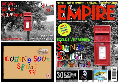
As you can see from the images above I have used the same style throughout my main task and my ancillary task.
As you can see the main link between all three tasks is the font used. I have used a font called Ransom Note. After a tedious task of trying to find one I found this. I chose to use ransom note because I thought it would go with the idea of the story (an unknown person posting letters and a postman going missing and we don't know why). It is quite mysterious as it looks like letters have been cut out and stuck down randomly.
There is a link between each of my ancillary tasks. The link between my poster and my magazine is that firstly I have used the same image. An image of a postbox in a quaint village in Hampshire with a black background and the postbox is red. I used this as i thought it would attract an audience when they see it either on the shelf in a shop or they see the poster on a billboard somewhere. The next link between the two is the same font (Ransom Note) again used to create mystery.
For my poster I decided to use red and white text as this is bright and bold. I also chose to use these colours as the white and red connotate blood and skin colours and there could be blood seen further on in my film. Although you cannot see some of the text straight away I decided to do this because it means the viewer of the poster has to look further into it to read what it says. This is the tagline for my film "Do you dare read your mail?". I decided to include "Spring 11" and "www.ssdmovie.com" as this is the website and the release date for my film. This gives the viewers a chance to research a bit more about the film on the website and try and create some viral marketing.
For my film titles in my teaser trailer I again used the Ransom Note font using a variety of colours on the envelope background. I also used the same for my magazine front cover. I used this so that when someone sees the text on the poster and then they see it on the magazine after they can automatically link it to that film they saw the poster of. This means hopefully they will be attracted to the magazine/poster. I have chosen to use a variety of colours rather than red/black/white as it will attract its audience to it.
No comments:
Post a Comment