Tuesday, 5 April 2011

In what ways does your media product use, develop or challenge forms and conventions of real media products?


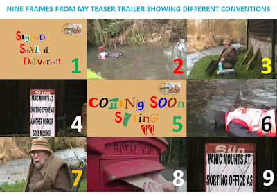
Above is nine distinct frames from my teaser trailer. I will be looking at how conventional/unconventional my teaser trailer is in this post.

Screenshot 1:
This shows my title and font used throughout my teaser trailer. The idea is that it is supposed to look like an envelope and the text follows on from the Poster and the Teaser trailer as I have used ransom note throughout all of my tasks to try and create suspense as if you don't know who is sending the letters. Each line of words appears one after the other and this works quite effectively is gaining the audiences attention when watching my teaser trailer.

Screenshot 2:
The second screenshot is of the location of my teaser trailer. The main part of this is in a river/on a river bank. This is similar to some other films that only stay in a few locations for the majority of the film. The reason I chose to have my character sitting there was to enable him to look like he was fishing and then suddenly look really shocked when he sees the body and the bag floating down the river.

Screenshot 3:
As you can see from screenshot 3 I have chosen to dress my character in some typical 'old man' fishing gear. I started off by getting him to wear some old trousers/top and then added a large fishing like jacket and hat to add even more effect to make it look more realistic. For props around my character I used an old tool box for a bait/tackle box, a flask as most fishermen stay overnight outside, a rod rest and two fishing rods. I think without any of these individual props it would look less realistic. This follows conventions of other teaser trailers as most others also do their research into what the characters need to wear in order to look more realistic in the film.

Screenshot 4:
This shows part of th story. Before yo see this a board advertising a newspaper headline you don't really know what is going on as yo just see the fisherman looking shocked and then you see the body. Once you see this you realise that the postman has gone missing and this isn't a one off occurrence. I think this shot really sets up the narrative in the teaser trailer as it gives the viewers more of an idea about what is going on.

Screenshot 5:
This screenshot shows the style used for all of my titles/inter-titles. I have followed on from the title again by using the same font on the same background in order to keep it looking consistent throughout all of the teaser trailer. Again this follows what other teaser trailers do by using the same text etc.

Screenshot 6:
This screenshot is to show just one of the variety of shots/positions used when filming/editing my film together. I think I have followed the typical conventions of a teaser trailer as i have used a variety of shots, transitions and effects throughout my teaser trailer. I think I have shown an improvement since last year when doing AS as I didn't do any filming then I just did editing. So I have had to learn a few things such as holding the camera steady, how to film from certain angles and how to use the tripod effectively.

Screenshot 7:
I have used this screenshot to try and show you what genre my film is. I could have used another shot of the body in the water but I have already used this twice so I opted to go for this shot. he reason I chose this is because in most horror films like mine you have someone who is genuinely shocked or scared. In my teaser trailer I have used this typical horror film convention by getting my actor to appear shocked and scared when he first gets a glance the body in the water.

Screenshot 8:
This postbox screenshot is used to show how one of the characters is introduced. Although you don't see this character appear in the rest of my teaser trailer you see their hand go up to a letterbox, deposit a letter and that is it. I did this because in other films like mine you have an element of the unknown. i.e. you don't know who it is and what they are doing. I used this in my teaser trailer to create suspense and get the audience guessing as to what is going to happen in the rest of the teaser trailer.

Screenshot 9:
This final screenshot I have used to show one of the props again. I used this to make my news headline look more 'real' and i thought the red at the top of this would also gain the viewers attention and draw them into this. The reason I used this prop is to bring the narrative together to try and give the viewers more of an idea about what is going on in my teaser trailer. Other horror films similar to mine also use titles/news to do the same thing.
How effective is the combination of your main product and ancillary texts?


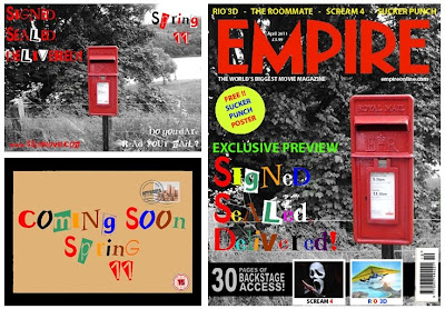
As you can see from the images above I have used the same style throughout my main task and my ancillary task.

As you can see the main link between all three tasks is the font used. I have used a font called Ransom Note. After a tedious task of trying to find one I found this. I chose to use ransom note because I thought it would go with the idea of the story (an unknown person posting letters and a postman going missing and we don't know why). It is quite mysterious as it looks like letters have been cut out and stuck down randomly.

There is a link between each of my ancillary tasks. The link between my poster and my magazine is that firstly I have used the same image. An image of a postbox in a quaint village in Hampshire with a black background and the postbox is red. I used this as i thought it would attract an audience when they see it either on the shelf in a shop or they see the poster on a billboard somewhere. The next link between the two is the same font (Ransom Note) again used to create mystery.

For my poster I decided to use red and white text as this is bright and bold. I also chose to use these colours as the white and red connotate blood and skin colours and there could be blood seen further on in my film. Although you cannot see some of the text straight away I decided to do this because it means the viewer of the poster has to look further into it to read what it says. This is the tagline for my film "Do you dare read your mail?". I decided to include "Spring 11" and "www.ssdmovie.com" as this is the website and the release date for my film. This gives the viewers a chance to research a bit more about the film on the website and try and create some viral marketing.

For my film titles in my teaser trailer I again used the Ransom Note font using a variety of colours on the envelope background. I also used the same for my magazine front cover. I used this so that when someone sees the text on the poster and then they see it on the magazine after they can automatically link it to that film they saw the poster of. This means hopefully they will be attracted to the magazine/poster. I have chosen to use a variety of colours rather than red/black/white as it will attract its audience to it.

What have you learned from your audience feedback?


Here is some audience feedback from my class when we watched each others teaser trailers and looked at the ancillary tasks:

Positives:

Teaser Trailer:
Music matches very well
All the images complement each other which makes it quite eerie
The sun newspaper headline - the little touch adds to mise en scene
Like the fact using real Royal Mail Jacket
You can clearly see you've put a lot of effort in
Shot types - hand held and steadiness of shots is good
Props - body is great and realistic
Ransom lettering looks good and goes with the film
Mixed up shots - not in order is eerie too
Newspaper - "another worker goes missing" makes you want to watch more of the film
Poster:
Red post box with the black background is good.
Good use of font throughout
Good picture with the river in the background

Magazine:
Good use of images
Great Layout
Looks just like a magazine front cover should do

Negatives:

Teaser Trailer:
Titles too bright - doesn't fit with mood
Opening logo - too long

Here are some comments from YouTube about my video:

"Really good video! I think that the length of the clips are good, as even though some other horror teasers may have shorter clips, the length of your clips reveals the plot, which is essential to your teaser. I especially like the part with the headlines, with the use of the word "another" revealing that this will be a main theme in the film if it were made. The negatives of the teaser are the transitions (fading to white) and sometimes the zoom on the postman is a bit wonky. But other wise good!"

"I think you have combined the props and location very well, it creates an eerie effect seeing a body floating down a river. You have shown the horror genre well by the tense mysterious music, costume and props. I like the part when the man fishing looks shocked with terror when he notices the body, this also makes the audience question what has happened. You have given away very little information in the teaser which makes the audience want to know more. The titles also show the postman theme and you have used the font like in a ransom note which is also very mysterious as it shows someone was after this character. Well done Dan :)"

"I like how you have used many different camera shots, for example your pans and zoom outs. Also your mise-en-scen is very good as you have used real Royal Mail clothing and 'The Sun' bulletin board.

However, I think that you could of filmed in a wider range of an area and introduced the character before seeing the body in the river.

Other then that, It all fits really well, the footage, the font choice and the music :) WELL DONE"


How did you use new media technologies in the contruction and research, planning and evaluation stages?


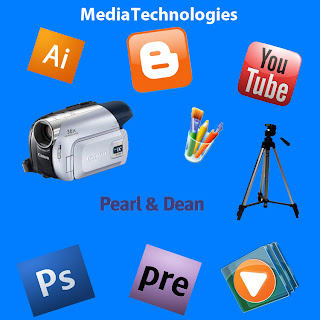
In order to create my teaser trailer I have needed to use all of the above equipment/programs.
I used YouTube to research similar teaser trailers and then blogger to add the videos and then analyse them. I also used an online resource called Pearl and Dean to to research the ages/gender and type of people that view similar films to mine in order to target mine to the right audience. I have used blogger to post my ideas, thoughts and developments that relate to my teaser trailer and ancillary tasks.

When I was making my teaser trailer I used a Canon camera and a tripod. With the footage I captured I then used Adobe Premiere Elements 7 to edit, cut and paste this all together. For the ancillary tasks (Magazine front cover / Film poster) I used programs such as Adobe Photoshop, Adobe Illustrator and Microsoft Paint to manipulate and change images and set them out to make them look like 'the real thing'. Over the 2 year course I feel I have improved when using the technology and software as last year I mainly did the majority of the editing rather than filming so I think I have improved on the filming/directing since last year.