Dan Rossell - G324
Tuesday, 5 April 2011
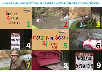
In what ways does your media product use, develop or challenge forms and conventions of real media products?

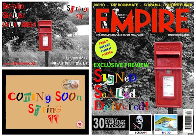
How effective is the combination of your main product and ancillary texts?
What have you learned from your audience feedback?
"I like how you have used many different camera shots, for example your pans and zoom outs. Also your mise-en-scen is very good as you have used real Royal Mail clothing and 'The Sun' bulletin board.
However, I think that you could of filmed in a wider range of an area and introduced the character before seeing the body in the river.
Other then that, It all fits really well, the footage, the font choice and the music :) WELL DONE"
How did you use new media technologies in the contruction and research, planning and evaluation stages?
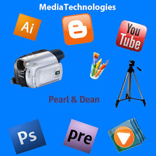
In order to create my teaser trailer I have needed to use all of the above equipment/programs.
I used YouTube to research similar teaser trailers and then blogger to add the videos and then analyse them. I also used an online resource called Pearl and Dean to to research the ages/gender and type of people that view similar films to mine in order to target mine to the right audience. I have used blogger to post my ideas, thoughts and developments that relate to my teaser trailer and ancillary tasks.
When I was making my teaser trailer I used a Canon camera and a tripod. With the footage I captured I then used Adobe Premiere Elements 7 to edit, cut and paste this all together. For the ancillary tasks (Magazine front cover / Film poster) I used programs such as Adobe Photoshop, Adobe Illustrator and Microsoft Paint to manipulate and change images and set them out to make them look like 'the real thing'. Over the 2 year course I feel I have improved when using the technology and software as last year I mainly did the majority of the editing rather than filming so I think I have improved on the filming/directing since last year.
Thursday, 31 March 2011
Monday, 28 March 2011
Saturday, 26 March 2011
Finished Filming / Started Editing
Friday, 18 March 2011
Certificate Rating
Only those over 15 years are admitted.
Nobody younger than 15 can rent or buy a 15-rated VHS, DVD, Blu-ray Disc, UMD or game, or watch a film in the cinema with this rating. This rating is similar to the. Films under this category can contain adult themes, hard drugs, strong words, moderate-strong violence/sex references, and mild non-detailed sex activity.
My trailer will be 15 because of the content it includes and I dont want to upset any younger audiences.
Monday, 14 February 2011
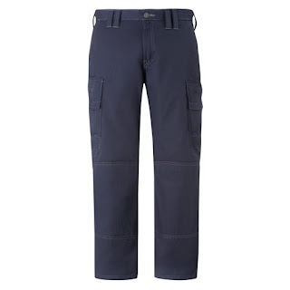
Costume Research
Wednesday, 9 February 2011
Shooting Schedule
Tuesday, 8 February 2011
Props Needed
Monday, 7 February 2011
Music / Sound Research
Today I was thinking about what music I could play over my teaser trailer. I have been looking on the website that I found music from last year (www.freeplaymusic.com) but yet to find anything even vaguely suitable due to the fact we can only use non-copyright music. This is hard to find for the type of film I am making. I will keep looking over the next couple of weeks to try and find something suitable and if I find anything suitable I will post it on my blog.
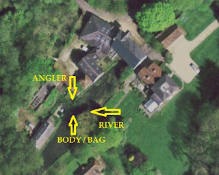
Location Shots
Monday, 31 January 2011
Dialogue / Script
Friday, 28 January 2011
Shot Lists
Thursday, 27 January 2011
Tuesday, 25 January 2011
Intertitles Practice
In my lesson I spent the hour looking at Intertitles and putting them into a short clip on Adobe Premiere Elements. This has allowed me to see how long my trailer is going to be roughly. As at this stage I don’t have an animatic storyboard I just used a plain background between the Intertitles to show me how long it is going to be. It is working out at about 1 minute and 5 seconds which is a reasonable length for a teaser trailer. I am going to add my certificate rating into my trailer at the beginning so any minors can be warned before watching this. My last shot will include when it is going to be released in cinema and my production / distribution company I will use which is yet to be decided. I will do some more research on this at a later stage once I have begun my filming.
Monday, 24 January 2011
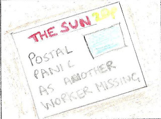
Storyboard
Saturday, 22 January 2011
Film Title
Today I came up with the name for my film. I am going to call it “Signed, Sealed and Delivered” which incorporates the missing postmen aspect of my film. I think it is very appropriate for my film. I am going to put this on the front of an envelope where the address usually goes. I think I am going to just use a plain font and a bright colour and bold text to attract the viewers of my teaser trailers attention to the film title.
Tuesday, 11 January 2011
Final Idea
Friday, 24 December 2010
Film Ideas
Monday, 13 December 2010
Target Audience
Monday, 29 November 2010
Shot Composition
Firstly we had to do a dentists waiting room we did this by going in to the reception area and we all sat down on the seats and we had someone walking through going to sit in the seat whilst filling out a form. This was quite successful as you didn't really have a clue that we were actually filming in a school reception. The props we used were books, flowers and pen/paper.
The next frame was a romantic date in a cafe. We used the staff garden as there was a picnic bench, mug and a newspaper for us to use. Two of us sat on the the bench with one person looking through the newspaper and the other person drinking from the mug. The two characters were looking into one anther's eyes and holding hands. I think this one worked quite well because the camera focused on the holding hands and the gazing into one anther's eyes.
The third frame was a busy office. We went to the school office and filmed them through the window. This one was not as effective as the others due to the fact we didn't have anyone really doing anything in it. We also didn't get a chance to use any props in this frame. To make the busy office frame better we thought we could have had someone walk into the office and interact with some of the office staff. This would have given us the chance to use props and get a better angle as we could have followed them down the corridor next to the office before they entered it.
The final frame we filmed was supposed to be waiting at a train station. I think this was one of our best ones due to the fact it genuinely looked as if it was at a station platform. We filmed this in the staff car park up against a high metal fence with spikes on the top. In the frame we had a light which made it look like it also had the station name attached to it. We had to characters in this one. The first was leaning up against the lamp post as if he was bored waiting for the train and the second was holding his tickets/phone and as he goes to answer he drops his tickets and this makes it look more realistic. The props we used were train tickets and the lamp post. In order to improve this frame we had some feedback given to us this was that we could have included a voice over of either someone stating that the train was arriving or another type of announcement they use at train stations like when you leave unattended baggage or no smoking etc.
I think this task has made everyone more aware of what we need to look out for when filming and that we can't have any aspect of a school or someones house it the teaser trailers. Overall this was a successful task.
Friday, 19 November 2010
Wednesday, 10 November 2010
Mood Board 1 - Initial Ideas
Mood Board 1
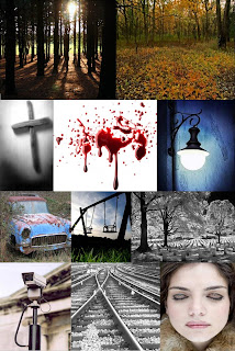
This mood board shows the different aspects of horror films. The first two images I used are of woodlands. I chose these because ideally I would like to set my film in the woods as I think it creates a good effect. The next couple of images I chose are of a crucifix, a blood splatter and a flickering street lamp. I chose the crucifix because I think alot of people associate this with horror films, the flickering lamp because it will create suspense and tension if the camera keeps going back to the light. It will be a good effect if I can find one of these when filming for my media teaser trailer. The blood is generally associated with most horror films and I think I will need some aspect of this in my teaser trailer. The next three images are of possible locations for filming. In a childrens playground with the swing, an old car garage with an old car and then a cemetery with a long row of headstones facing the camera. The last three images are of a security camera, train tracks and a lady with some scary eyes. I chose the security camera because I can add an effect at the end to make it look like some of the footage is filmed through a security camera with the date/time stamp in the corner. The train tracks becuase trains are often asssociated with speed and I would like my trailer to be fast paced in certain parts.
Tuesday, 9 November 2010
Paranormal Activity 2 - Teaser Trailer Analysis
Seeing as I am quite interested in doing a horror film I thought I would analyse another horror film. This film has just been released in the cinema and it is a sequel of Paranormal Activity.
The audience can tell that this is a horror film due to the fact there is dark clours and white noise is used quite a bit (white noise is the noise when a TV screen is blaks and just fuzzy). We also get to see the footage from the hand held camera which is shown throughout the film.
We do not know much about the plot at all. If the audience have seen the previous film then they may know some of what is about to happen however if not they will only know as much as they have seen in the teaser. All the audience my know from the trailer is the woman (the main character) is possessed and she is possibly putting the others in the house in great danger.
The unique selling point of the film is in my opinion the way they have pieced together the different footage whether it is the hand held type or the security camera style footage filmed through the alarm sensors. And the way it shows what time the footage was taken e.g. 23:45 - 14/07/06.
As the film is a horror film I would suggest the target audeince is people aged between 15 and 30. There is no music throughout the trailer apart from the noises when the camera switched between shots. There is a mix of high angle shots, mid shots and low angle shots. This makes the film more realistic and in keeping with the whole security camera feel to it.
I think that there is a new type of film that the public wan't to watch. This being the hand held home footage type. Therefore I may have to consider this when doing some more planning for my teaser trailer.
The titles hold the trailer together, they manage to speak to the audience give information and they continue from one scene to the next. They reveal the title of the film, release date and previous information of the prequel.
In my opinion 'Paranormal Activity 2' trailer really does show how grasping and attracting a teaser trailer can be using the shots and times that they have used. It is what makes the viewers want to go and watch the film and it makes it more of an immersive viewing experience for them.
Research and Planning - To Do List
- Upload and analyse a variety of teaser trailers (Complete)
- Film treatment
- Storyboard teaser trailer (Complete)
- Mood Board of Ideas (Complete)
- Images of costumes and props
- Mind map / List of different genres (Complete)
- Initial ideas (Complete)
- Upload music ideas
- Draft script if theres dialogue (Complete)
- Upload and analyse practice scenes
- Visit and get images of location (Complete)
Teaser Trailer Questionnaire
I will distribute these between my peers and then people outside of my school. The main reason in creating this is to gain more of an undestanding of what peple want to watch and how often etc.
Once I have seen all of the results I will collate them and then analyse them in detail.
1. What sort of teaser trailers attracts your attention when you see them?
- Full of action with big effects used
- Mysterious teasers that don’t give much away
- Teasers that reveal far too much plot when seen
- High quality teasers that look great
- Teaser trailer whereby you recognise either the actors starring in it or the director and producer.
2. In your opinion what is the ideal length of a teaser trailer?
- 30 Seconds
- 60 Seconds
- 90 Seconds
- Longer
3. Are you Male or Female?
- Male
- Female
5. What kind of music is more suitable in a teaser trailer?
- Fast paced music
- Slow paced music
- Music that sounds happy and up beat
- Sad gothic music
- No music at all
6. Would you and have you ever gone to see a film just based on the teaser trailer?
- Yes
- No
7. What is your age?
- 10-18
- 19-24
- 25-30
- 31-40
- 41-50
- 50+
8. How often do you watch a horror film?
- Never at all
- Once every few years
- Once a year
- Once every 3 months
- Once a month
- Once every fortnight
- Once a week
- More often than once a week
9. What is your favourite genre film?
- Horror
- Action
- Thriller
- Comedy
- Romance
- Sci-Fi
- Cartoon
- Family
- Other
10. What is your favourite horror film?
______________________________
11. What influences you to watch a film?
_________________________________
12. Do you watch teaser trailers before you find out about the flms release?
_________________________________
Super 8 Teaser Trailer Analysis
After watching the Super 8 trailer you can clearly see thy have used very quick editing this then gives us an idea that the film be an action fim. The audience are enticed in to watch more by a large explosion which keeps you on the edge o your seat at all times waiting to find out what happens next in the clip.
The music used in the trailers used to create suspense just like the majority of other teaser trailers.
The creators of Super 8 trailer are also making the viewers aware of the fact that the director JJ Abrams has also directed Cloverfield nd created the Lost TV series. And then the producer Steven Spielberg who is also wll known for his films such as Jaws and E.T. This will therfore excite the sci-fi / action film fans. In the titles you see the fact that area 51 was closed in 1979 this gives us a clue to when the film was set and the type of film that you are about to watch because if you know about area 51 you will realise that it is well known for spotting extra terrestrial life.
Something also seems to be alive on the train, it isn't part of the human species as the titles refers to it as 'it' this means that it may not have a gender so isn't human.
Super 8 has different meanings and different people interpret it in different ways.
The Social Network - Teaser Trailer Analysis
This film is all about the social networking site Facebook. It is based on the university life of Mark Zuckerberg, the inventor of Facebook and it focuses on the fact that he invented Facebook and shows us the journey he edeavoured to get it to this stage in the World Wide Web.
This teaser traier doesn't really reveal a lot of the story or the plot however it reveals who the main character is an portrays to us some of his characteristics.
There is hadly any images use within tis teaser. The main reason behind this is I think that they on't want to reveal toomuch information before the man trailer release closer the actual flm release date. All you see is a terribly out of focus image of him which slowly zooms out to become a more clearer image of him. Over th top of this image you see words flash up whilst the vice over is talking. These are some of the key wod picked out from wht the narrator is saying for example "Genius" they use this to show that the gut who is creating Facebook is a genius, another one being "Traitor" as they are talking about suing him for 'stealing' the inital concept before he adapted this to his own liking and one of the last phrases to flash up is "You don't get to 500 million friends, without making a few enemies" which tells us that he ha had to undergo a tough journey to get where he is today. At then end the last thing we see is "The Social Network" and then "October" it then displays the web address below which again gives us the idea they are trying to get s to further our knowledge about the film by looking this up thtough their viral marketing campaign.
I think the unique selling point of this film is the rie of facebookad how it is known so well globally. This film i believe has a very large target audience from young teens wo use Facebook regularly to the older generation who perhaps want to find out why Facebok was fist created.
2012 - Teaser Trailer Analysis
This film (2012) is classed as a sci-fi, revoling around the end of the world which is caused by torrential floods covering the whole world in the year 2012. They try to make it like nothing any population has seen to date.
The music that the have used in the film helps create tension perfectly! And it makes the whole viewin experience more immersive.
The majorty of the angles and shots used within 2012 are used in order to create even more suspense than you imagine. They use a close ups of fast paced events, therefore enforcing a panic for the viewer. Then they use extreme close ups of actors faces to show the emotions between them. Teaser trailers are usually fast paced and quick howver I found ths one to be edited together quite slowly!
Where they have been used special effects have been used well. They are used when the waves come crashing down over the mountain tops.
The creditsand inter titles are all in the same font. At the end you see it says "Google Search:2012"
they get you to research this, the main reason that they do this is to create a lot of hype and tension about the film and get people searching for this online which I believe to be the unique selling point of the film.
Saturday, 6 November 2010
UP - Teaser Trailer Analysis
'UP' by Disney's PIXAR, aplies all ofthe conventions of a teaser trailer in it. It doesn't reveal any of the storyline and it only lasts around 60 seconds. This is one of the only teaser trailers I have found that is below 60 seconds long and still shows the basic conventions.
The main purpose of this trailer is to try and attract an audience by making them intrigued by what is happening and to idetify what genre the film is. UP teaser trailer doesnt reveal alot. All you see is a bunch of balloons flying up into the sky and attached to the bottom of them is a house with an old an standing on the balcony. He says "Good Afternoon" after this we see UP appear from underneath the clouds. This shows the release date and that the film is being shown in 3D.
This is aimed at a younger audience and I fully believe this meets expctations of a teaser trailer for this particulr age range.
Friday, 5 November 2010
Preliminary Task - Therfield Teaser
I will upload this when I have a chance to use these computers later in the week or early next week!
Coursework Genre Ideas
Horror
- Hand held camera work
- Makes viewer feel like their in the film
- Gory
Guts
Often lots of blood
- Killings
- Suicide
- Homicide
- Murder
- Often brutal and inhumane
- Often no dialogue used at all during teasers
- Tense music followed by screams and cries for help
- Often show a character being intimidated by another character
Chick Flick / Rom-com
- Often follow a relationship between a male and female
- Show a link between the two of them whether this is a strong or weak link depends on specific films.
Drama
- Often very story based and the trailer always has to show the elements that appear in the film without telling the actual story
- Show elements of the lifestyle they live in
Musical
- Often a small community of people grouped together to form a 'family'
Cartoon / Animations
- Animations
- Often popular with young children
- Usually big names are watched by a wide variety of people e.g. Simpsons, Wallace and Gromit
Comedy
- Slow shots used
- Something big usually happens before the main story
- Very humorous
Action / Adventure
- Often exciting stories
- Usually contain searches or expeditions
- Searches for the unknown
- Common features in action films
Guns
Cars
Men in suits
Fast paced Cuts throughout the film
Women
Thriller
- Provides thrills
- Keeps the audience hanging in suspense
- Plot builds to a quick climax before the end of the film
- Life is threatened in dangerous situations
- Often filmed in a 'normal' suburb or city
- Getting increasingly influenced by the horror genre due to more gore and sadistic violence
Science Fiction
- Often mainly Computer Generated Images (CGI)
- Fiction stories
Scream 4 - Teaser Trailer Analysis
This is the teaser trailer for Scream 4. This is the fourth film in the series.
It is directed by Wes Craven and written by Kevin Williamson. Although the film is now 10 years on it still stars Neve Campbell as SIdney Prescott, David Arquette as Sheriff Dewey Riley and Courtney Cox as Gale Weathers Riley. These are the only returning characters from the original films.
Genre: Horror, Thriller, Mystery
Narrative:
Representation:
Audience: 18
Media Language:
Saw 3D - Teaser Trailer Analysis
The reason I chose to analyse this film is because I think it is a good example of a horror film and I am hoping to do a teaser trailer for a horror film for my coursework.
This is the teaser trailer for Saw 3D, this is the first Saw film to be shot in 3D technology.
Monday, 1 November 2010
The definition of a teaser trailer
Sunday, 31 October 2010
What is a Teaser Trailer?
- Often 30-80 seconds long.
- Not much information is given away during the teaser trailer the main reason being that they have not finished filming the footage or they are still editing. Sometimes they don't even use footage that ends up in the actual final film.
- A teaser trailer is usually made to create a certain degree of hype about the film..
- Teaser trailers often use quick cut shots and only use limited dialogue.
- Teaser trailers reveal the following
- A teaser trailer is often shown in a non-sequential order. The main reason is that the production company do not want to give away too much detail about the film and they want to create more of an immersive viewing experience for the viewer when they watch the final film.
Friday, 29 October 2010
AS Media Studies Blog
Rather than working with my partner that I was with last time I am going to be completing the project on my own.


